In class, Aaron and I did a short presentation going over the general ideas and storyboard for our music video. Explaining the shots and location that we are planning on using to see what they thought and to listen to feedback so that we could adapt our ideas, taking into consideration what they said.
Below are some of the comments that we got back from the class after our presentation.
What works well?- 'Narrative and performace together is a good idea'
- 'Good use of shots and angles'
- 'Good exchange between scenes'
- 'Good variation of shots and angles'
- 'Great idea, very clever and original idea'
- 'Shot choice is very sensible, will work well'
- '360 shot will work well'
- 'Good location, works with music genre conventions'
- 'Good idea of having two cameras'
Even better if...- 'More editing effects'
- 'Make sure cuts dont get too fast for the video'
- 'Fast cut montage would keep it interesting'
- 'Think about colourisation'
- 'Will it work with bad weather?'
- 'More different camera angles and colourisation'
- 'Try to use Goodwin's Theory to your advantage'
After reading through the feedback and comments that we got on our music video idea, it is clear that the location was definately a good idea as it is a place that links in well with the music genre. The shots that we have thought about so far seem to be interesting and not the average ahots that are used most of th etime such as medium shot, close up etc. One of our best and most original ideas, personally I think is the idea of having two cameras and making it look like the girl is filming which seemed to go down well with our class.
It is obvious that like us, they did think however that it is impossible to plan around the weather because it could change at any second, for this reason it is even more important that we think of other places that we could use for the location. We also need to make sure that we use colourisation and editing to make sure our video is intersting, and we show our skills on the mac.


 I will use serif page plus to take exact colours from the photographs that I took from the day we filmed and use them for the tasks. The three main colours used will be yellow, blue and brown so that they match the images on the digipak and advert.


 Paolo Nutini is an artist in the same genre as our artist, he plays mainly acoustic music and has the same target audience as who we are aiming our products and music at.


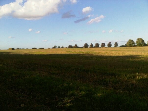 We have chosen to have our music video filmed in an open field, to go with the genre of our music artist. After looknig at artists in the same genre as Tom, such as Jack Johnson, we thought that a field would make it seem natural, and go with the acoustic music.


 This is Jack Johnson's album cover for 'In Between Dreams'.
  This is the album cover for Jason Mraz's debut album 'We Sing, We Dance, We Steal Things'.
 This is the cover for Paolo Nutini's album 'Sunny Side Up'.
 This is the website for 'The Saturdays'.
  This is the website for 'You Me At Six'.
 This is the website for 'Susan Boyle'.